

Like designing DoorDash for Aspen
I was the sole product designer working with a small team to redesign a food delivery service for a seasonal town in the Swiss Alps. By digging deep into user and business needs I was able to find win-win solutions to multiple issues.
Keep scrolling for the story. Or, jump to the solution here.


TL;DR
Problem
Verbier Delivery is a delivery service in the Swiss Alps. The team built it scrappily a year ago to assess demand (of which there ended up being a lot), but the resulting site had severe usability issues and lacked in several areas - but the team wasn’t sure which / where to start. These issues & opportunities had to be proactively identified, prioritized, and eventually designed.
Solution
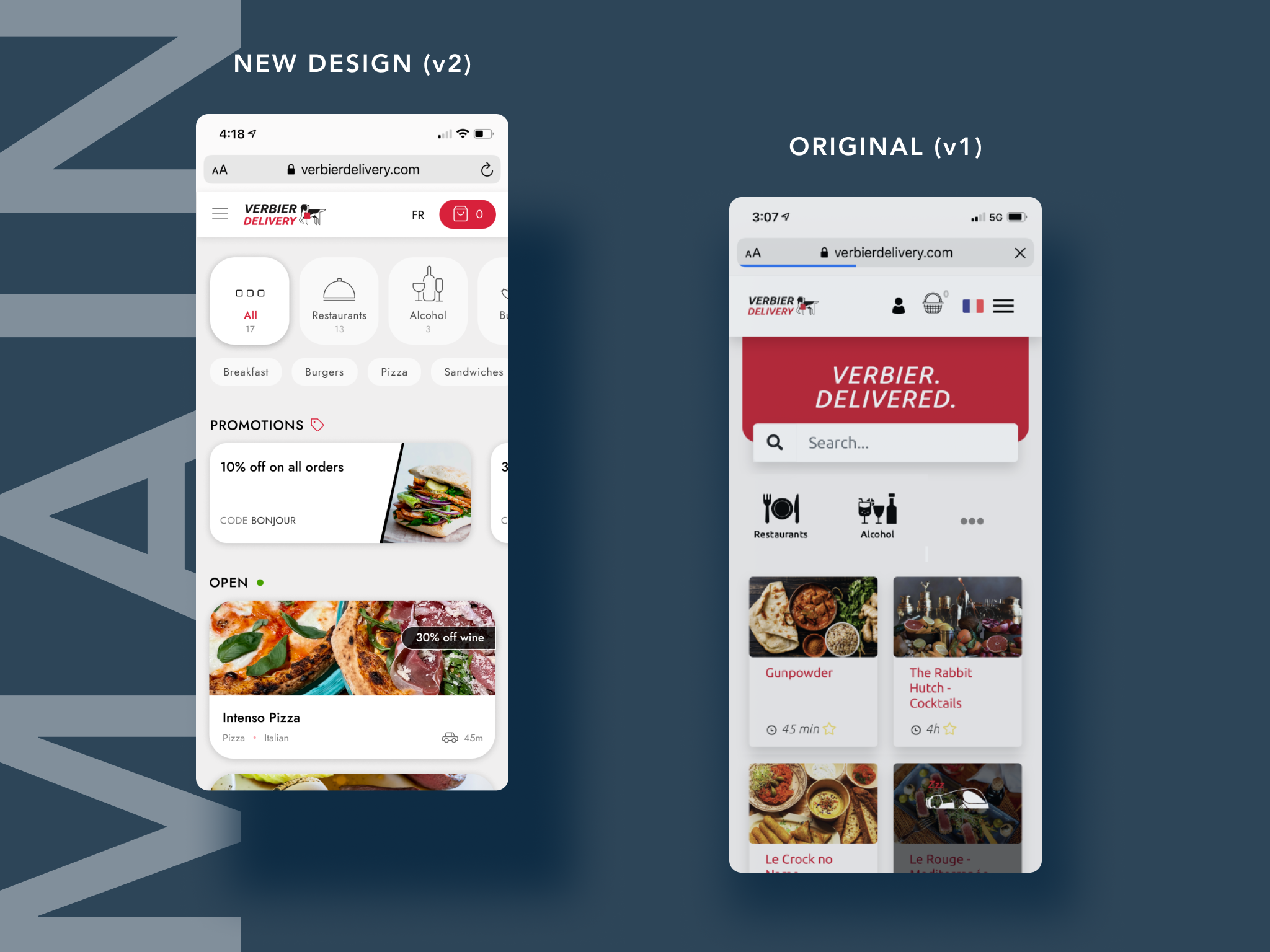
A responsive site that meets current delivery best practices while being tailored to the Verbier community. In particular, the new design addresses previous key issues (lack of transparency around delivery fees, confusion around delivery vs takeaway, lack of an area for promotions, clutter), and aims for visual consistency.
My Role
As the sole product designer, I owned ideation, strategy, and design. I presented ideas to and strategized with their small team (founders and customer experience) regularly. Here are things I did:
Product Management
User Research
Ideation and Strategy
UX and UI Design
Usability Testing and Prototyping
Branding and Component Creation
When design was done, I coordinated with their third-party engineers in the implementation phase.

“Basically the site isn’t ideal -
just make it better.”
— E. Paternot, Verbier Delivery founder
Problem Space
But what does “better” even mean?
The Verbier team wanted to make a food delivery site that married best practices with the specific needs of the clientele, and helped them with their biggest delivery pain points while working with the limitations of the tech (web, not an app). But they didn’t know what I should work on, or even how to prioritize. They just knew that something was wrong.
My game plan to figure out what needed to be fixed:
Know who I was building for (their needs, pain points)
This meant sending out a survey to existing users, talking to a few of them.
Know the other stakeholders
This meant understanding the nuances of the Verbier business community, talking to Verbier Delivery drivers.
Understand best practices
Looking at comparable companies, see how they handle certain elements of the business.
Understand the current business and how it was performing
This included a full site inventory, and a deep dive into data and analytics in FullStory.
The goal was to have a solid research base to make assumptions about what was working and what wasn’t working, all while keeping the needs of the users and players in mind.
Key Insights
Here’s what I discovered.

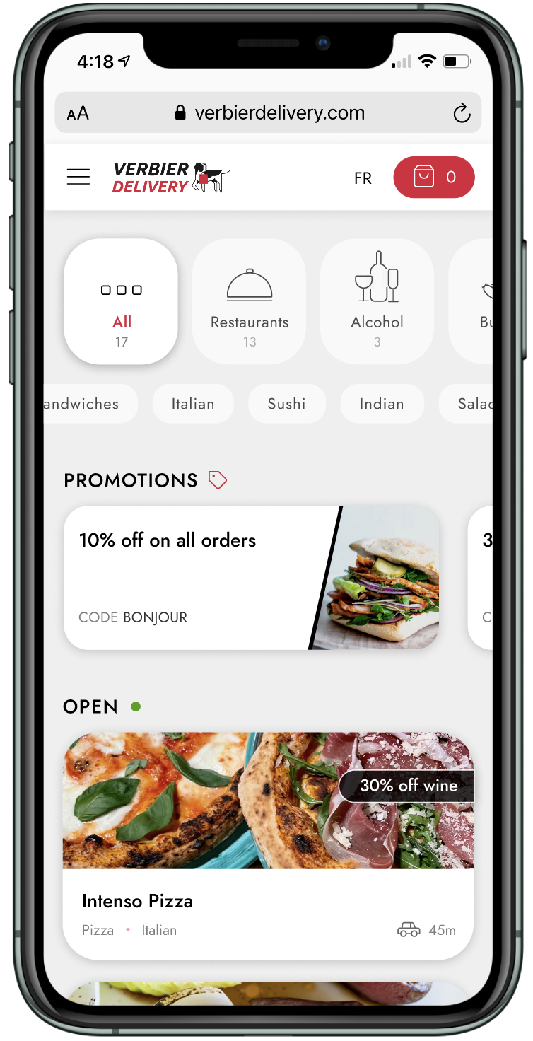
No. 1: Despite its prominence, almost no one used the search bar.
Instead, users would scroll to find restaurants. Verbier might have 35,000 residents at peak, but only a few restaurants. Why use search when there are only a dozen restaurants available at a time?

No. 2: Users would confuse delivery and takeaway.
This was mainly due to the fact that the “delivery address” was a key part of the checkout form no matter which option you picked. Checkout in particular needed many improvements.

No. 3: The top user complaint was how expensive the delivery fee was.
With a flat fee of 12 Swiss francs and an explanation buried in the FAQ, users would assume that all of it was going to Verbier Delivery. FullStory revealed that this opaque fee dissuaded many from finishing their order.

No. 4: Drivers would occasionally get lost finding a chalet.
Google Maps sometimes struggled to properly plot delivery addresses. This would lead to disappointment all around - drivers would fruitlessly search for the address as the food got cold, and users would be angry that their food was missing.
Competitive Analysis
What are the current best practices in the space?
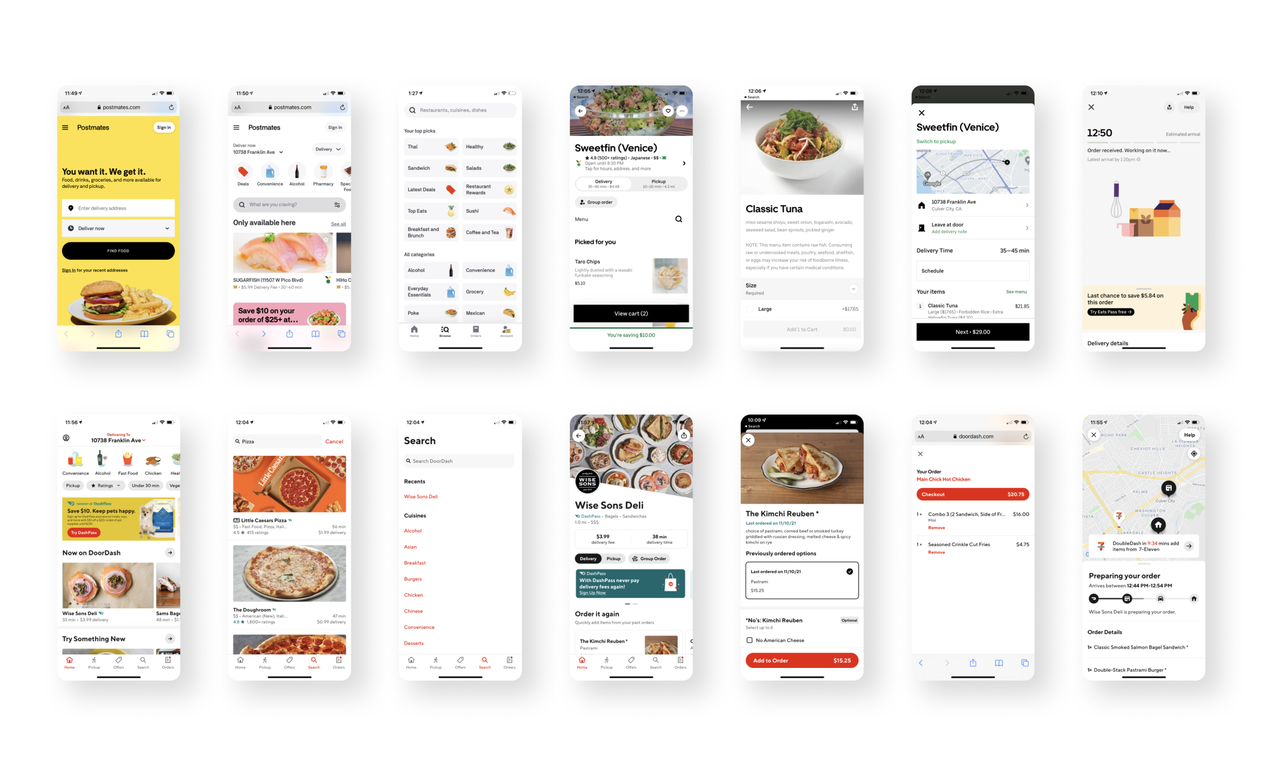
I broke the design down into key components (main page, business page, checkout flow, account, etc), and observed how top comparables accomplished each step. There are no direct competitors in Verbier, so I looked at top food delivery models in the US (DoorDash, UberEats, Postmates, Seamless, Grubhub) and the UK (Deliveroo) to see what was being done.
The biggest insight was that those competitors, having to deliver to whole countries with thousands of restaurants in their system, had different priorities. The main focus of huge companies was helping users make a decision, which meant offering search as the main form of discovery, offering advanced filters, etc.
In comparison, Verbier was one small town. Narrowing down choices wasn’t going to be as helpful for users - effectively presenting the few choices there were, was.
The Opportunity
What were we building?
After doing the research and identifying the biggest pain points, the team and I agreed that these were the biggest opportunities:
Explain where the delivery fee goes.
Make clear the difference between delivery and takeaway (especially for the less tech savvy).
Build a truly helpful filtering system that doesn’t depend on the search bar.
Help drivers find delivery locations when needed.
From a visual perspective, I also knew I wanted to create more consistency - this meant rethinking typography and main components, and creating a more consistent icon set.
UX Phase
Putting it all together
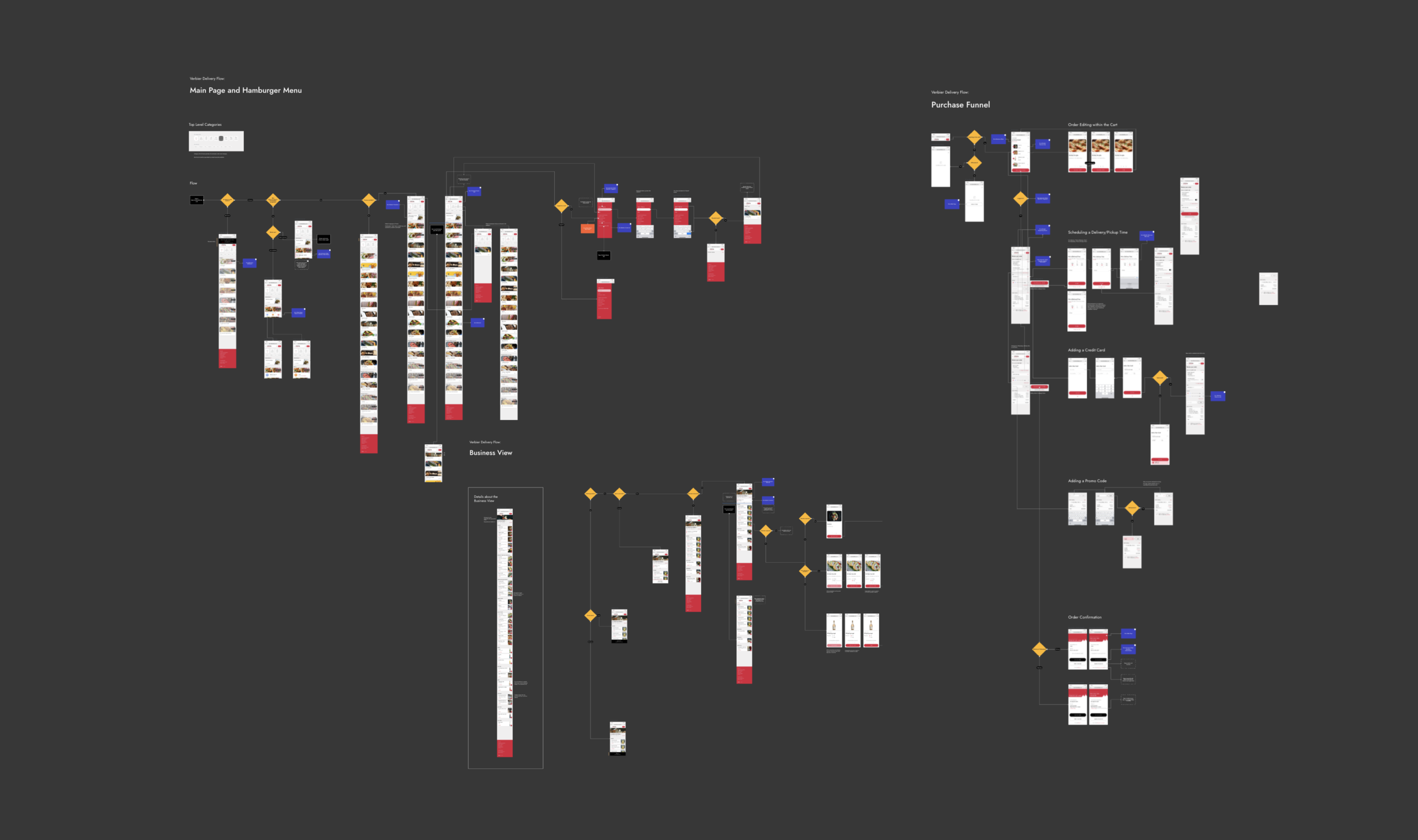
On every screen, I created research-based or best practice-based assumptions about what a user would need to see, and what could safely be de-emphasized. Every application of a best practice was deeply considered and not blindly followed, which meant that I intentionally deviated from those practices several times in the design. Each screen began with multiple iterations, slimmed down through debate and testing.
Some of the questions I asked myself during this stage:
Choosing what to eat can be paralyzing. How can I help a user make a decision? How can I better display what is available, when there isn’t much available?
Ordering for delivery means accepting a hefty delivery fee. How and where can I explain this to users? What if they never see drivers doing dropoffs, how might I garner more camaraderie for drivers?
Drivers don’t check ID, but the Verbier team still wanted to make sure those ordering alcohol knew they had to be 18. What sort of checks could we do?
So, the order is done. What would help a user when they want to check an order’s status?
UI Phase
The Solutions
Here’s how I ended up solving core issues.
Challenge No. 1:
How might users find a business?
Key design decisions here:
Search - not used often; moved to the hamburger menu
Business categories - updated icons, added an ‘All’, added quantity to set expectations
Keywords - added top keywords to each business to set expectations; included all keywords in an additional submenu to provide an additional way to filter
Sorting - businesses are now sorted by ‘Open’, ‘Pre-order’, ‘Closed’, ‘Coming Soon’ to set ordering expectations; these remain sticky to the top when scrolling
Promotions - now featured at the top of the screen to provide for extra marketing
Challenge No. 2:
How might I clarify the delivery vs. takeaway issue?
Key design decisions here:
Prioritizing deliveries - the Verbier team prefers delivery orders, because that’s how their drivers earn an income. Delivery is therefore default, and takeaway becomes the secondary affordance.
Targeted information - only showing the delivery address (and contact-less dropoff option) for deliveries; only showing pickup address for takeaway
Reinforcing CTA - “Place Delivery Order” vs. “Place Takeaway Order”
Localizing language - while in the US we use “takeout”, the locals use “takeaway”. Go with what’s familiar.
Order Confirmation - further emphasizing what a user has chosen (delivery vs. takeaway)

Challenge No. 3:
How might users better understand the delivery fee?
I knew two facts to be true: 1) Verbier is an extremely small, close-knit town; 2) during the covid era and contact-less delivery, it’s possible that users will never see the drivers doing dropoffs. Thus, I not only wanted to explain the delivery fee (which went entirely to drivers), but I wanted to re-emphasize the connection between the drivers and the community. I ideated and proposed this flow to the Verbier team, and they were thrilled.
Multiple areas to explain the delivery fee - I put the delivery fee explanation in three separate places (next to the delivery address, next to the charge in the order total, and at the end) so that users wouldn’t miss it
A page dedicated to drivers - on the user side, the page humanized the hardworking drivers and provided that meaningful connection. On the business side, this helped emphasize how long drivers stayed with Verbier Delivery, which was testament to how well they were treated.

Challenge No. 4:
How might we circumvent the possibility of drivers getting lost?
We knew that: 1) most of the time, delivery addresses were easy to find; but that 2) sometimes they weren’t, and that was catastrophic.
Key design decisions here to ease the latter situation:
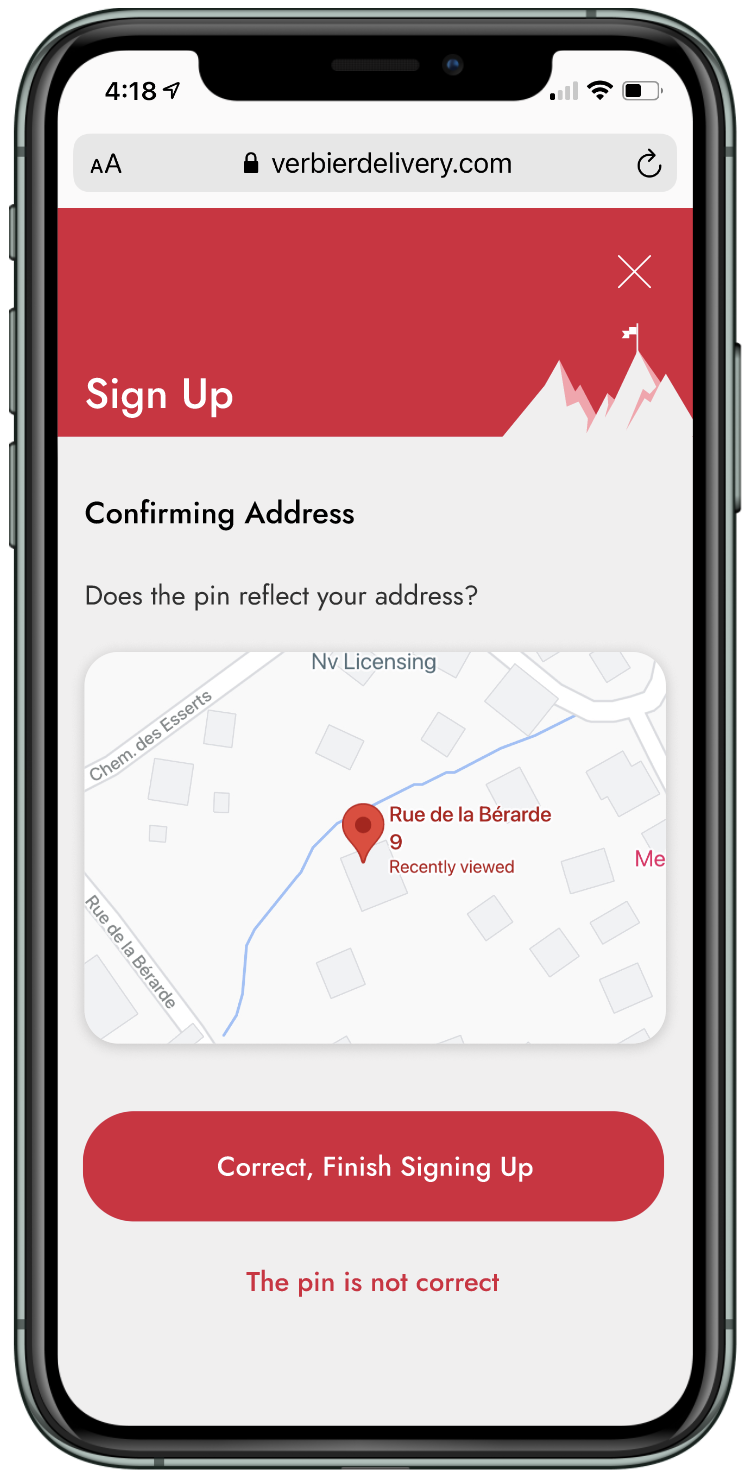
Splitting the sign-up process - this made it easier to focus on what was being asked
Checking your pin - this was an extra step, but a quick and easy way to help the user figure out if their address was showing up correctly without troubling them with moving pins
Solving for incorrect pins - we encourage users in this situation to give step by step instructions to help their drivers find their address
Taken together, we’re hopeful this will substantially cut down on delivery address mishaps.
Challenge No. 5:
Post-purchase experience
There’s nothing more frustrating than wondering where your order is, and having to navigate through a confusing menu to check order status. I strove to have a shortcut to your order on the main screen, for user convenience. I had to work with the developers to figure out what was possible - ideally we would have had real time status (in process, out for delivery, etc), but since it was web, the devs would have had a hard time “refreshing" it.
We settled on a doable compromise (the ‘order in process’ toast) that went on to test incredibly with users.
In addition, I suggested a post-delivery rating system. This would standardize feedback, and help the entire business model improve. (Prior to this, all feedback had to be manually emailed to Verbier Delivery).

Usability Testing
Welcoming surprises
As designers, we all start out with an idea of how things will go, and sometimes we ended up being surprised.
Here is an example of one of those:
Original:
When designing the main screen and the business screen, I needed a quick icon to display the delivery time. Competitors all used a clock icon. I assumed this was a best practice that would be understood by every user and a good place to start.
Testing:
Many people were confused by the clock icon. Some even assumed it was when the restaurant was going to open! People also understandably wonder whether the time reflected when it would be delivered OR ready for pickup.
Pivot:
To clarify that it specifically meant delivery time, I designed a car icon and implemented that instead. This small, seemingly insignificant change clarified it for every single subsequent user.
UI Phase
Branding and Visual Design
I wanted to evoke Swiss minimalist design alongside higher-end touches familiar to Verbier’s upscale clientele. I used the original branding color palette, but changed key elements to create this minimalist luxury feel.
Here’s how I did that:
Typography: I used one of my favorite fonts, Jost, throughout the design. I chose it for the design specifically because I find it to be incredibly crisp and elegant in its readable simplicity. I used only two different weights, and played around with caps and sizes for hierarchy.
Icons: I designed an icon set that used clean lines and gently rounded shapes.

Lessons Learned / Next Steps
Being clear, keeping boundaries
There was a moment, as I was wrapping up visual design and showing the latest prototype to the team, that one of the team members piped in. “I realized belatedly that it would be really nice if we had somewhere to put the promos. It shouldn’t be too difficult I think.” Famous last words. (…it actually took me hours of rework.)
One of the biggest key points that I took away from this project is the importance of setting scope, putting it in writing, and holding to it. I had done that verbally during meetings, but allowed scope creep, which made the project much longer than I expected.
This project is currently under development, although I am still helping with red lining. Already, we’ve cut the average ordering process by a full minute. Looking forward to seeing how it continues to perform!
Have thoughts about this project?
Send me a message, I’d love to talk.