
The daily meal grind is hard.
I designed a mobile app to make meal planning, well, a piece of cake.
Because this was a solo passion project, I was able to operate under my version of an ideal process, taking the time to validate and understand the problem so that what to build and how to prioritize would be clear - including whether it was worth building in the first place.
Scroll for the story, or jump to the solution here.

TL;DR
Problem
People cook daily, and yet the entire process of saving recipes and shopping for ingredients is still so manual. This tedium causes most people to wing it, creating massive inefficiencies that lead to wasted time, money, and food.
Solution
A mobile app that aims to help with every step of the meal making process - importing recipes from anywhere, saving them in a simple and streamlined format, allowing recipe tagging and meal planning, and generating shopping lists.
This will be developed by a third-party engineer in early 2022.
My Role
As the sole person on this project, I was able to wear all hats:
Product Management
User Research
Ideation and Strategy
UX and UI Design
Usability Testing and Prototyping
Branding and Illustration
Throughout, I consulted with an engineer to assess technical feasibility.
Problem Space
First of all, was there a problem worth solving?
Week after week, I knew my biggest struggles were around planning and making meals for a busy family of four.
I was curious if others had the same problem, so I sought to understand the process by which others cook. I talked to targeted users (parents, working professionals) and sent out a survey to the broader community, looking for more than 50 responses.
Key Insights
Here’s what I discovered.

No. 1: People can easily find recipes (but consider their formats irritating).
Most people either google for recipes (80%) or get them from friends and family (40%). There’s no lack of delicious, vetted, recipes with reviews online.
However when they found the recipe, they complained about “scrolling forever” to get to the recipe, and ads. 62% had to do manual conversions at some point, converting oz to cups.

No. 2: … but people have difficulty saving those recipes for later.
Users had a variety of recipe saving techniques, all of them painstaking: the biggest methods were “memory” (30%) and "printing out a hard copy” (16%). Others would keep the tab open, take screenshots, or email the recipes to themselves.
Most of these techniques resulted in people forgetting to return to recipes, mainly because they forgot how to return to them.

No. 3: People want to meal plan, but they don’t have the time…
When cooking, there is a natural tension between ease (staples are easy to make, easy to remember) and variety (new recipes require more planning and effort). People gravitate to the same series of recipes despite their best intentions.

No. 4: … in a large part because it’s so difficult to get the right ingredients.
Most people shop very often (84% shop at least once a week). They usually rely on manually populating a list (76%), usually on a notes app on their phone. Despite this “planning”, 72% of people have had to make an unscheduled trip to the grocery to retrieve a missing ingredient.
Key Quotes
The anguish is universal.
“I buy ingredients for meals that I end up forgetting to cook, and then everything just rots. I end up with a lot of food waste.
— Karina L.
“Week after week, I end up cooking the same thing. My entire family is so bored, but it’s too hard to remember new things.”
— Carolyn G.
“I hate grocery shopping. I’ve been using Instacart and just order the things that I know we use. This does not help me in making full meals...generally just leaves me with a lot of bread, eggs, pasta, and random produce.”
— Jackson F.
“I don't ever know what I’m going to cook for the week. I am winging it and flailing.”
— Susan A.
Competitive Analysis
But wait, is anyone solving this problem adequately?
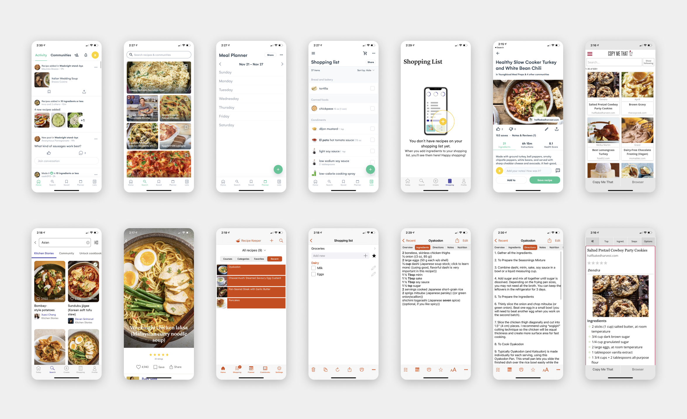
Knowing there was a problem, I took a deep dive. There were a ton of recipe/meal planning apps out there - surely someone was solving this problem? By meticulously documenting 5 competitor apps (Whisk, Kitchen Stories, Copy Me That, Recipe Keeper), I learned that:
The better-designed apps focused on recipe finding through a social network (even though this wasn’t a user pain point), but missed out on core issues like importing recipe directions.
The less designed apps ignored social and focused more on needed functionality, but had serious UX issues.
It was clear that this field was ripe for the innovating. Let’s get going!
The Opportunity
What am I building?
A solid research foundation helped me laser focus on only the biggest pain points.
In short, I could safely ignore recipe finding (or creating some kind of new social network - we probably have enough of those). Instead, v1 of the app would focus on:
Saving recipes from anywhere;
Designating certain recipes as part of the meal plan;
Generating a grocery shopping list that self-consolidated.
Based on other user feedback, it would also ideally convert recipes to the user’s desired system of measurement.
UX Phase
Initial quick ideation
Armed with my trusty iPad, I drew out a few rough ideas of how an app might work so I could assess each idea quickly, and try out a variety of ideas. This is one of the earliest iterations.

UX Phase
Making ideas more tangible
Throwing things into wireframes helped me understand the design compromises at stake, and led me to converge on the strongest solutions.
Here are some of the questions I asked myself during this stage:
What is a user trying to accomplish on a given screen? i.e. what should be prioritized? what can be moved elsewhere?
What should the goal of onboarding be? Guiding a user to add their first recipe, or pre-filling their recipe collection so it doesn’t look empty? Should users have to be guided at all?
Sometimes two people in a household share meal planning/cooking duties. Should there be a way to link accounts together? Or should there be a shared login?


UI Phase
The Solutions
Here are a few of the design solutions as they related to the discovered core problems.
Challenge No. 1:
How might users remember favorite recipes?
Key design decisions here:
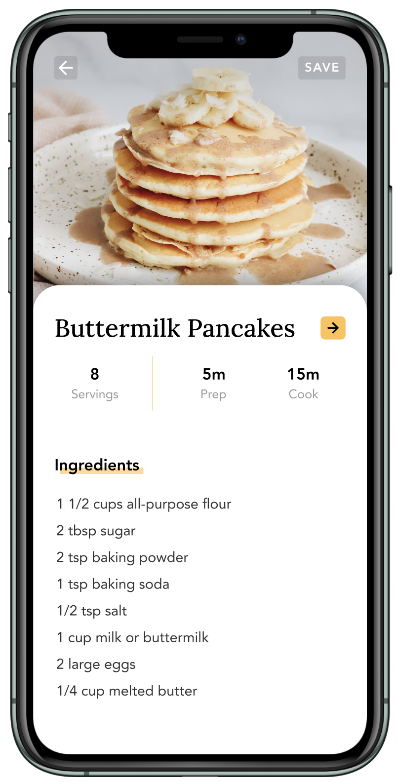
Offering two ways to add recipes - by default, the main method of adding a recipe is copying and pasting a URL, with creating your own recipe as a secondary link. This reflects research on user behavior.
Clear, simple recipe format - cutting out extra life stories, or ads, and keeping one main photo. This allows users to focus on only the important bits.
Challenge No. 2:
How might users organize recipes?
Key design decisions here:
Tags (instead of single destination collections) - allowing a single recipe multiple tags allowed users to flexibly classify a recipe many ways, and find it again in many ways, based on their needs. So looking for "kid-friendly” when you’re trying to feed your picky eater could yield chicken tenders, and looking for “paleo” when you’re trying to be healthy could do so too.
Asking for tags when a user saves a recipe - this helps them organize their recipes automatically
Recipe quantity indicator (e.g. 14 out of 20 recipes) - directly correlates to a user tapping on a filter or filters
Search - an easily accessible shortcut for when an exact craving strikes (and you know its name)

Challenge No. 3:
How might users plan their week?
Key design decisions:
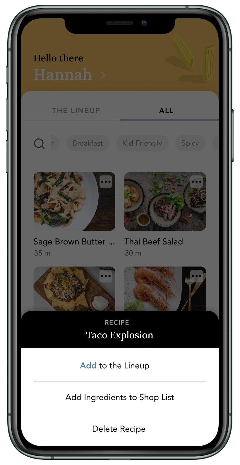
Segmented controls (with The Lineup as default) - this is the meat of the app, a quick way to get to what you’re cooking soon.
Adding to Lineup via Quick Menu in ‘All’ - tapping on a ‘More’ icon on each recipe allows you to add to the lineup. This was as opposed to a ‘Select multiple recipes to add’ process, which might be faster, but didn’t align with the thoughtfulness users had when meal planning (they tend to look through each recipe first and assess before adding to a meal plan vs adding in bulk)
Lineup recipes vs normal recipes - I created a distinguishing factor (a bright yellow line) to serve two purposes: 1) lessening the chance of duplicative recipe adding by showing which recipes are already there; and 2) adding an instant confirmation factor (after a user adds a recipe to their Lineup, there is confirmation they added it)
NOT making a user assign a recipe to a day - other meal planning apps force users to assign a recipe to a specific day. From user testing, this didn’t seem worth the extra user or engineering effort, since users didn’t usually know or care when a certain recipe would be made, just that it would be made at some point soon.
Challenge No. 4:
How might users cook more efficiently?
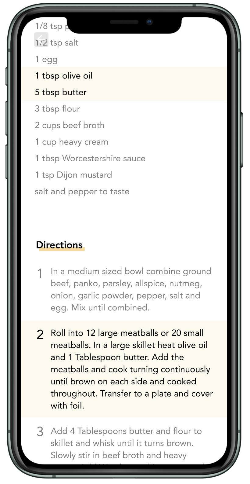
“Okay so I mix the vanilla extract and the milk together… wait how much of each again?”
I was originally going for the ability to cross out directions to give users an idea of where they were, but user testing made it obvious that users needed help understanding the ingredients and directions together.
Now, if a user taps on a direction, it highlights the related ingredient quantities. No more endlessly looking for an ingredient on a long list - this made it easy for users to focus on the task at hand.
Challenge No. 5:
How might users more easily grocery shop?
Key design decisions:
Sorting methods - default by ‘Section’ which is how users actually shop, but also allows for sorting by ‘Recipe’
Checking-off items pushes them down the list
Section quantities - allows users to understand how many ingredients they still need to shop for
Adding items - allows them to add multiple items at the same time, for convenience
A future release for this section will be allowing users to rearrange the order the sections are laid out - not just seeing them alphabetically - to actually match the way they navigate through their store of choice.

Challenge No. 6:
Saving users from the drudgery of measurement conversions
Most users said they had to manually convert ingredients at some point.
By asking users during onboarding which system of measurement they preferred and performing the conversion automatically when a user imports a recipe, I could save users from having to google “how many oz in a cup”.

Usability Testing
Verifying design decisions
I remotely tested my design at various stages of the process. While testing with low-fi prototypes was important, I did most of my testing with high-fidelity because I find users have an easier time grasping something closer to reality.
While the design tested well and received much enthusiasm, I’m of the firm belief that you’ll only truly find out how your design does when it’s out in the wild, so stay tuned for its release in 2022.
Here’s an example of how feedback shaped design:
Original:
On the recipe screen, I began with the hypothesis that a user’s biggest pain point was remembering where they were in the recipe. So I designed a crossing-out affordance for when a user was done with a step.
Testing:
While testing, I would instead see users scrolling back and forth between the ingredient quantities and the directions. They would spend an inordinate amount of time searching for actual ingredient ratios. I realized they didn’t need crossing out - they needed to better tie ingredients with directions.
Pivot:
I tried a few different ways to do this. Eventually, the best technical implementation ended up being the ability to “highlight” a step and its related ingredients by tapping on it. (see more about this on challenge 5).
UI Phase
Branding and Visual Design
In the Philippines, food is a vehicle for love. For care. This is what I wanted to impart with every bit of this product. The name of my app, Malu (MAH-loo), is the Filipinx word for main course “ulam” (OOH-lam) spelled backward. It’s meant to sound soft and evoke an approachable friendliness. Unlike most recipe/meal planning apps - straightforward, utilitarian, a means to an end - I wanted to impart the happiness that comes with putting together a meal for a loved one.
Here’s how I did that:
Copy: I used conversational language (“Hello there, Hannah!” “So, what’s for dinner?”) to make a user feel like that were with a friend.
Typography: I mixed a soft and friendly serif (Lora) with a tried and true sans serif (Avenir) to provide approachable structure.
Colors and shapes: I chose a color palette that leaned on a cheery, somewhat muted mustard yellow, and emphasized white space, rounded corners, and subtle shadows. I created icons for the tab bar that were simple, with geometric shapes to bring focus.
Illustrations: One of my favorite parts was hand drawing all the illustrations on my iPad. I aimed for a simple, naive style, basic shapes, with complementary colors, to make Malu feel more personal.

Lessons Learned / Next Steps
Focusing on the “why”
Being my first self-initiated project, it was both exhilarating and terrifying to be the sole decision maker. It was easy to get carried away, and go beyond MVP. There were a million other ideas that weren’t pursued, at least for this initial release, because first the idea had to be proven in its barest form. Working through this project was a fascinating dance between unlimited ideation, and reeling it back in because of reality and scope, all the while keeping top of mind the problems that were trying to be solved.
Next up for Malu is finding the right developer, and getting it ready for the world. I’ll update this project when that happens!
Have thoughts about this project?
Send me a message, I’d love to talk.